An interactive visualisation tool for the hierarchical clustering of large data sets

Poster
Athanasios Vogogias, Christine Hackett

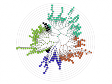
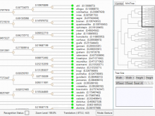
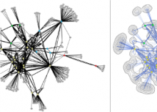
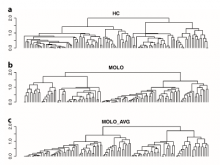
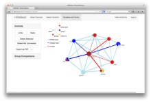
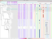
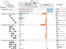
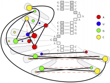
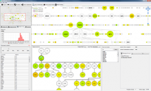
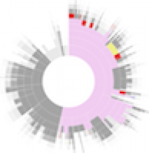
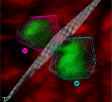
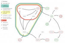
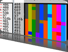
Rigid adherence to pre-specified thresholds and static graphical presentations can lead to incorrect decisions on merging of clusters. We have developed an interactive approach to visualize progress of the average linkage clustering algorithm. The user can see similarities within the clusters and edit them if appropriate. An interactive dendrogram is constructed, which can be displayed in different layout configurations and scales. Results can be viewed in real time, when the user modifies parameters such as the similarity threshold at which clusters are merged and the level of tolerance to intra-cluster distinctiveness, for which we use the term 'heterogeneity'.

BioVis 2014 Information

Interactive Exploration of Spatial Distribution in Mass Spectrometry ImagingNeXO Web: An integrated ontology visualization application for modern web platformsTreemap Visualization of Personal Genomic ReportsHitWalker2: An interactive and queryable web-based framework for variant prioritization in precision medicineGWAS Viewer - a fast and interactive visualization for GWAS resultsConTour: Data-Driven Exploration of Multi-Relational Datasets for Drug DiscoveryAn interactive visualisation tool for the hierarchical clustering of large data setsMCAweb: an interactive graphical tool for Multiresolution Correlation Analysis in single-cell dataGingr: Interactive visualization of large-scale phylogenies and multi-alignments.NeuroLines: A Subway Map Metaphor for Visualizing Nanoscale Neuronal ConnectivityLONGEVITY: A novel visualization platform for interpreting multidimensional gene expressionExploration of metagenome assemblies with an interactive visualization tool.